

How to Reduce Checkout Abandonment on an Ecommerce Site Without Rebuilding
If your store is getting traffic but too many baskets are disappearing at checkout, you do not necessarily need a rebuild. In many cases, ecommerce conversion rate optimisation at the checkout stage is about removing friction from the existing flow, not replacing the platform.
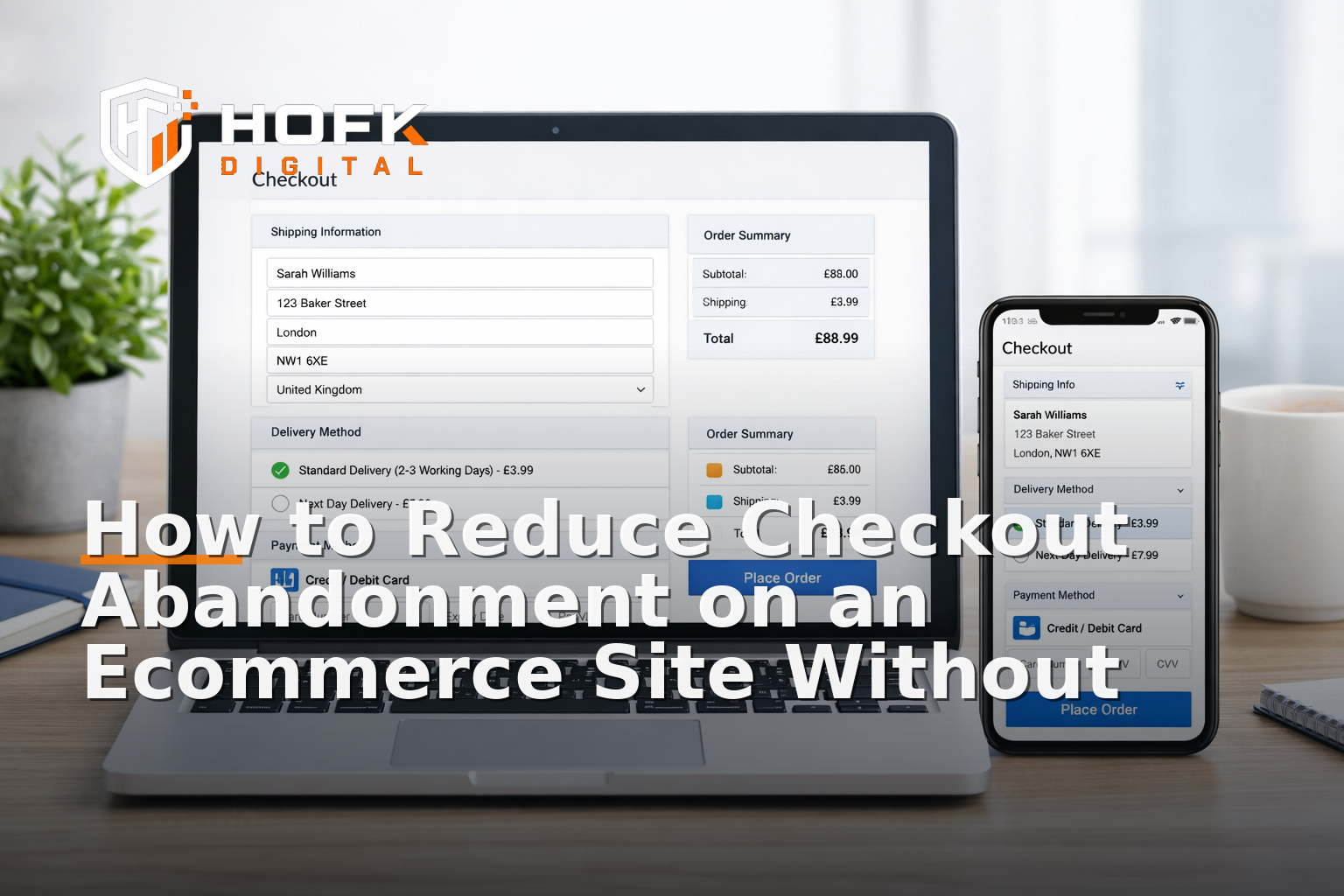
The checkout is where small issues become expensive. A confusing form, an unexpected delivery cost, a missing payment method or a vague error message can be enough to stop a purchase. The good news is that you can often reduce checkout abandonment with targeted changes on the current site, provided you know where customers are dropping off and what is slowing them down.
This guide focuses on one part of the funnel: the checkout. It is aimed at UK ecommerce teams who want practical ways to improve ecommerce conversion rate without taking on a rebuild project.
Start by identifying where abandonment is happening
Before changing anything, work out which checkout step is causing the most drop-off. A basket-to-checkout gap is a different problem from a payment-step problem, and each one needs a different fix.
Look at:
- Basket exit rates
- Checkout start rates
- Shipping step drop-off
- Payment step drop-off
- Order completion rate
If your analytics setup is limited, you may need to add better event tracking before making assumptions. A lot of ecommerce conversion improvements fail because teams optimise the wrong step.
For example:
- If many users leave after seeing delivery costs, the issue may be pricing transparency rather than checkout design.
- If users begin checkout but do not complete the address step, the form may be too long or too strict.
- If users fail at payment, the issue may be payment choice, validation, or a gateway error.
Remove form friction first
Forms are one of the quickest places to reduce checkout abandonment. If the checkout asks for more than it needs, or asks for information in a confusing order, people will leave.
Review every field critically
For each field, ask one question: do we genuinely need this to complete the order? If not, remove it.
Common opportunities include:
- Optional company name fields that can be hidden unless relevant
- Unnecessary second address lines
- Marketing opt-in fields shown too early
- Phone number requirements where they are not operationally necessary
- Account creation prompts that interrupt guest checkout
Make errors easy to recover from
Users should not have to guess what went wrong. Error handling is often overlooked, but it has a direct effect on checkout completion.
Good checkout errors should:
- Explain what is wrong in plain English
- Point to the exact field
- Keep already completed information in place
- Use formatting that works on mobile
For example, a message that simply says “invalid input” is not helpful. A better message is “Please enter a valid postcode” or “This card number is incomplete”.
Reduce typing on mobile
On smaller screens, every extra tap matters. If your checkout is still awkward on mobile, that will hurt conversions even if desktop performance looks fine. HOFK’s Mobile-ready design work is relevant here because checkout usability and responsive behaviour are closely linked.
Useful mobile fixes include:
- Using the correct keyboard for email, number and postcode fields
- Auto-filling address components where possible
- Reducing repeated entry of the same information
- Keeping buttons visible without excessive scrolling
Make delivery costs and timings clear earlier
One of the biggest reasons to reduce checkout abandonment is simple: customers dislike surprises. If delivery charges only appear late in the process, you may lose buyers who were otherwise ready to order.
This is not always a checkout bug. Sometimes it is a communication issue. If the basket page, product page and checkout do not agree on delivery expectations, trust drops.
Practical improvements include:
- Showing delivery thresholds earlier in the journey
- Making standard delivery times easy to understand
- Explaining any regional or express delivery differences
- Confirming whether next-day delivery is truly available before payment
If customers repeatedly abandon at the shipping stage, test whether the problem is the price, the wording, or the timing of the information.
Improve trust signals at the point of payment
At checkout, customers are making a decision under pressure. Trust signals help them feel that the site is legitimate, secure and straightforward.
Useful trust signals include:
- Clear payment security wording
- Recognisable payment method logos
- Visible returns and support links
- Customer service contact details that are easy to find
- Delivery and returns summaries near the payment step
These should be subtle and factual, not cluttered or exaggerated. A checkout is not the place for long marketing copy. It is the place for reassurance.
If your product category is higher consideration, or if you sell to businesses, customers may also want to see signals such as invoice options, VAT clarity or order confirmation expectations. These details can reduce hesitation.
Offer the payment methods customers actually want
Payment method choice can materially affect conversion. If the available options do not match buyer expectations, you may be creating avoidable abandonment.
For a UK audience, it is worth reviewing whether the checkout supports the methods your customers expect most often. The right mix depends on your audience, average order value and platform, but the key point is to avoid forcing users into a payment route that feels inconvenient or unfamiliar.
When reviewing payment methods, ask:
- Are the main card options visible and reliable?
- Do mobile users have a fast payment path?
- Is there an express option for repeat customers?
- Are there any payment methods that fail too often or confuse users?
- Do business buyers need something different from consumer buyers?
If your current gateway or checkout setup supports faster methods, surface them clearly and test the placement. If it does not, you may still be able to improve the presentation and sequence of options without changing the whole platform.
Check for hidden technical friction
Some checkout abandonment is not caused by design at all. It comes from technical issues that are easy to miss until customers start dropping out.
Examples include:
- Address lookup delays
- Timeouts during payment handover
- Coupon codes that break the flow
- Stock or shipping recalculations that refresh unexpectedly
- Validation conflicts between front-end and back-end logic
This is where full stack development experience becomes useful. The visible checkout may look fine, but if the underlying workflow is slow, brittle or inconsistent, customers feel the friction.
A practical approach is to test the checkout like a customer would:
- Use a real mobile device
- Start from product page to checkout
- Try a few common payment scenarios
- Test with and without discount codes
- Check what happens after an error
If a step feels slow or uncertain to a human, it is likely costing orders.
Keep guest checkout easy to find
If creating an account is required too early, some customers will leave rather than continue. This is especially true for first-time buyers and mobile users.
Guest checkout should be easy to understand and easy to select. If accounts are useful for repeat orders, loyalty or order tracking, present them as an option rather than a barrier.
A balanced approach is:
- Let people buy first, then prompt account creation after purchase
- Explain any benefits of an account in one short line
- Avoid forcing password creation before the customer has committed
This is a common, practical way to improve ecommerce conversion rate without changing the underlying commerce platform.
Use monitoring to catch checkout issues early
Checkout changes often fail quietly. A form field may stop validating correctly, a payment callback may begin timing out, or a shipping rule may block a valid order. If you are not watching for these issues, you may only find out once revenue has already dropped.
HOFK’s article on How to Build an Ecommerce Monitoring Stack: Uptime, Checkout Errors and Monthly Review Checks covers this in more depth. For checkout optimisation, monitoring matters because it helps you spot problems before they become repeat abandonment.
Useful checks include:
- Synthetic checkout tests
- Error logging on payment and shipping steps
- Alerts for sudden changes in order completion
- Mobile-specific failure monitoring
Monitoring also helps separate a genuine conversion problem from a temporary technical fault.
Review checkout copy with intent
The words in a checkout should reduce uncertainty, not create it. Many checkouts use too much generic language or hide the most important details behind icons and small print.
Review the wording on:
- Delivery messages
- Returns reassurance
- Payment explanations
- Coupon code prompts
- Order confirmation wording
Good checkout copy is short, precise and customer-focused. It should answer the questions people have at the exact moment they are about to pay.
If your site also relies on search and landing pages to drive paid traffic, this is where SEO and Google Ads support can matter too. Poor landing page quality or mismatched promises can increase basket abandonment later in the journey. HOFK’s SEO & Adwords support can help make sure campaign traffic lands on pages that match the checkout promise.
A practical checkout optimisation checklist
If you want a simple starting point, work through this checklist in order:
- Identify the checkout step with the highest drop-off
- Remove fields that are not genuinely needed
- Improve error messages and field-level guidance
- Check mobile typing and tap friction
- Show delivery costs and timings earlier
- Add or improve trust signals near payment
- Review whether payment methods match customer expectations
- Test the flow on real devices and real browsers
- Monitor for errors after each change
This is usually a better use of time than planning a rebuild before you have tested the obvious fixes.
When a rebuild is not necessary
Sometimes a checkout is too constrained to fix fully on the current platform. But in many cases, the issue is not the platform itself. It is the way the checkout has been configured, extended or allowed to drift over time.
That is why a focused ecommerce conversion rate optimisation approach is often the most sensible first step. You can usually make meaningful improvements by tightening forms, clarifying delivery, improving payment choice and reducing technical friction.
HOFK works with ecommerce, responsive websites, full stack development, automation and operational efficiency, so this kind of checkout work can be approached practically rather than as a blanket redesign. For some businesses, the right answer is not a new website. It is a clearer checkout process on the one they already have.
Conclusion
If you want to reduce checkout abandonment, start with the checkout itself. Look at where customers drop off, then remove unnecessary fields, improve error handling, clarify delivery and returns, strengthen trust signals and review payment methods. These changes are often enough to deliver real ecommerce conversion improvements without rebuilding the site.
The best ecommerce conversion rate optimisation work is usually specific, measurable and operational. It focuses on the step where money is won or lost. If your checkout is underperforming, the right fix may be a sequence of small practical improvements rather than a full platform replacement.
If you need help reviewing checkout behaviour, testing technical friction or improving the customer journey on an existing site, HOFK can support with ecommerce development, full stack implementation, monitoring and operationally focused digital work.
Frequently asked questions
What is the quickest way to reduce checkout abandonment?
Usually the fastest wins come from removing unnecessary form fields, improving error messages and making delivery costs clearer earlier in the journey.
Do I need a rebuild to improve checkout conversion?
Not usually. Many checkout issues can be improved on the existing platform through configuration, copy changes, payment option review and technical fixes.
Which checkout issues cause the most abandonment?
Common causes include unexpected delivery costs, too many fields, poor mobile usability, missing payment methods, weak trust signals and technical errors during payment.
How do I know whether the problem is design or technical?
Test the checkout on real devices and review analytics by step. If users are dropping off with no obvious content issue, there may be a validation, gateway or performance problem.
Should I remove account creation from checkout?
Not necessarily, but guest checkout should be easy to find. Making account creation optional until after purchase can reduce friction for first-time buyers.