

How to Troubleshoot Variant Default and Stock Logic on Ecommerce Product Pages
If a product page is underperforming, the problem is not always the copy, the imagery or the button placement. Sometimes the issue is far more operational: the page defaults to the wrong variant, hides the wrong stock state or shows merchandising logic that no longer matches how the business sells.
That is where product page variant optimisation becomes less of a design exercise and more of a troubleshooting task. On variant-heavy stores, especially fashion, footwear, bundles and configurable products, a small logic error can quietly affect conversion, margin and customer confidence. The page may look fine in a browser preview, while the underlying selection rules are sending shoppers down the wrong path.
This guide is for UK ecommerce managers, founders, marketers and operations leads who need to diagnose the hard part: not whether the page looks good, but whether the default variant, availability rules and fallback behaviour are commercially sensible.
What usually goes wrong
Most variant issues fall into a few repeat patterns. The page may:
- default to a low-stock or unpopular variant
- show one variant as available when it is not fulfilable
- keep a sold-out size or colour visible as the default choice
- fail to reset messaging when the shopper switches variants
- show a generic stock message that does not reflect the selected option
- send users to a dead end when the chosen variant is unavailable
These are not small inconveniences. They affect the way shoppers interpret the product and whether they trust the page enough to continue. In practice, this is a common failure mode in ecommerce product page optimisation because the visible design can be tidy while the underlying logic is still wrong.
Start by separating the three layers
Before changing anything, split the problem into three layers:
- Presentation layer - what the shopper sees on the page
- Selection layer - which variant is defaulted, highlighted or hidden
- Inventory layer - what the stock system says is actually available
When those layers drift apart, the page becomes hard to trust. A product may look in stock because the page template is showing the parent product as available, while the selected child variant is actually unavailable. Or a bundle may default to an option that the trading team no longer wants to prioritise.
A useful rule is this: if the page says one thing, the selector says another, and the back office says a third thing, the issue is not just visual. It is a logic problem.
Check the default variant first
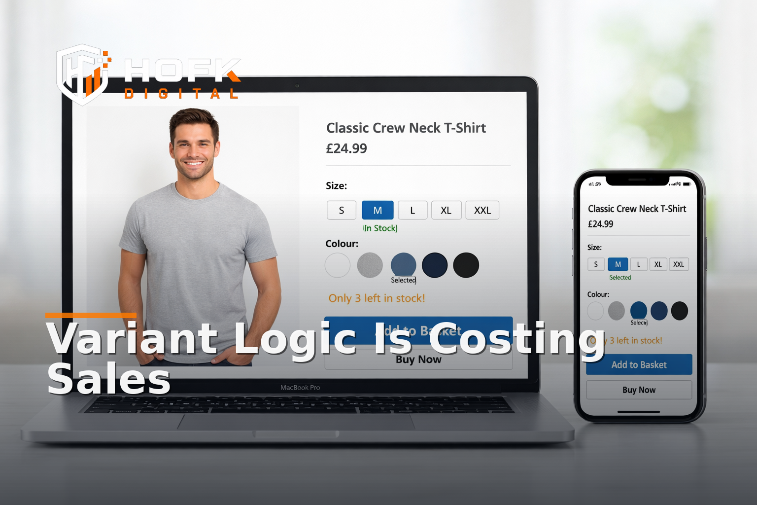
The default variant matters more than many teams realise. It controls what is loaded first, what gets seen in product imagery, and sometimes what gets added to basket if the shopper clicks quickly.
Ask these questions
- Is the default variant the one the business actually wants to lead with?
- Is it the most common size, colour or pack configuration?
- Is it in stock consistently enough to support default status?
- Does it reflect the best commercial choice, not just the first variant in the data feed?
In fashion, for example, the default might be a core colour and an average size range rather than the first variant created in the CMS. In bundle-heavy catalogues, the default may need to be the most useful bundle rather than the cheapest single item. In either case, the default should be intentional.
If you have ever seen a product page land on a size that most users cannot buy, or a colour that is almost always out of stock, that is a default variant problem, not a merchandising win.
Test what happens when stock changes
Stock rules should help the shopper keep moving. Instead, they often create confusion when one variant sells out and the page does not react cleanly.
When testing variant default and stock logic, simulate three states:
- Variant in stock - does the page load the expected option and message?
- Variant low in stock - does the page create urgency without becoming misleading?
- Variant out of stock - does the page switch gracefully to a sensible alternative?
What you are looking for is not just whether the page displays a label like “low stock” or “sold out”. You are checking whether the logic behind that label supports a purchase path.
If a sold-out colour still appears as the first option, the user may bounce before they realise an alternative is available. If the page hides the only viable size instead of promoting it, the problem becomes one of navigation and merchandising strategy as much as inventory.
Product page variant optimisation for fallback logic
Fallback logic is where many product pages quietly leak revenue. A fallback is what the page does when the preferred variant cannot be offered. That might include a size substitution, a colour swap, a nearby bundle, or a “notify me” route.
Good fallback logic should answer three practical questions:
- What should the page show if the default variant is unavailable?
- What should happen if the shopper changes the selection to an out-of-stock option?
- What alternative path keeps the customer engaged?
In some stores, the fallback is simply the next available variant. In others, it is a different pack size, a related colourway or a prompt to join a waiting list. There is no single correct answer, but there should be a deliberate one.
If the page is sending users to a blank state, a broken button or a basket error, the fallback logic is not doing its job.
Look for logic that changes without telling the shopper
One of the most frustrating problems in variant selection UX is when the page updates behind the scenes, but the user is not clearly told what changed. That can happen when stock changes after page load, when the platform auto-switches a variant, or when a selection triggers a hidden update to the price or image.
Check whether the page makes these changes obvious:
- price changes after variant selection
- imagery updates to match the chosen option
- delivery messaging changes by size or colour
- bundle contents update when a pack is selected
- stock state changes when the shopper switches back and forth
If the customer has to guess why the page changed, the experience feels unstable. In ecommerce product page optimisation, clarity matters as much as accuracy.
Audit the relationship between stock and merchandising
Stock logic is rarely just a fulfilment issue. It is also a merchandising decision. What gets defaulted, surfaced or deprioritised often reflects a trading rule, even if nobody has documented it.
Ask whether the current page logic is doing one of these things:
- prioritising high-stock items over high-demand items
- showing the highest-margin variant first
- keeping slower stock visible longer than it should be
- hiding an important option because the feed or template treats it as low priority
Sometimes this is intentional. Sometimes it is a legacy rule that no longer fits the business. The point is to know which one it is.
This is where ecommerce merchandising strategy and variant logic overlap. If the merchandising team wants one default and the operations system pushes another, the product page ends up serving neither objective well.
Check the selector UX on mobile
Variant issues are often worse on mobile because space is limited and the user is moving quickly. If the selector is hard to tap, collapsed too aggressively or unclear about what is currently selected, the page loses momentum.
Review the variant selector on a phone and ask:
- Can I tell which option is selected at a glance?
- Are unavailable variants visibly distinct?
- Does the selector stay usable after the page updates?
- Do I need too many taps to reach the right size or colour?
This is not only a UI question. It is a conversion question. A user who cannot quickly choose the right variant is less likely to reach basket. HOFK’s Mobile-ready design work is relevant here because responsive behaviour and selection clarity are closely linked.
Do not ignore edge cases
Most problems appear in the awkward cases, not the happy path. Variant troubleshooting should include the pages and combinations that are easy to miss in testing.
Look at:
- one-size-fits-most products
- products with limited seasonal ranges
- bundle products where one item is unavailable
- products with discontinued colours still visible in the CMS
- products where the parent product is in stock but one child variant is not
- products that use separate data feeds for price and stock
If the store has multiple suppliers or warehouse rules, check whether the page respects those rules consistently. A variant that is technically active may still not be sellable in the way the page implies.
A practical troubleshooting sequence
If you need to debug a live product page, work through the following order rather than guessing.
- Open the page in a clean browser session. Check the default variant, image, price and stock message.
- Switch to a different variant. Confirm the page updates all dependent elements.
- Test the lowest-stock option. Look for odd priority, broken labels or misleading availability.
- Test an unavailable option. Confirm the page gives a useful fallback rather than a dead end.
- Check the basket handoff. Make sure the chosen variant survives add-to-basket correctly.
- Repeat on mobile. Many selector and stock issues are more obvious on a phone.
This sequence often reveals whether the problem is data, template logic, or an edge-case rule in the platform.
When the problem is deeper than the page
Sometimes the visible symptom is a page issue, but the root cause sits elsewhere. For example:
- the stock feed is lagging behind the storefront
- the CMS is using a fallback rule from an old campaign
- the product template is not listening to the variant state properly
- the basket logic is dropping the selected variant on handoff
- the data structure does not support clean parent-child relationships
That is where full stack development support can be useful. If the problem is buried in template code, custom product logic or integrated stock data, the fix may need more than merchandising edits. It may need the underlying flow to be made more reliable and easier to maintain.
Build a small checklist for ongoing control
Variant logic should not be something the team only notices when sales dip. A short recurring check can prevent quiet revenue leakage.
Use this monthly or after any catalogue update:
- Are the default variants still commercially sensible?
- Are sold-out variants still being surfaced incorrectly?
- Do low-stock labels match actual trading rules?
- Does the page fall back cleanly when a variant is unavailable?
- Does the selected option survive the basket handoff?
- Are mobile selectors still clear and tappable?
- Have any new product types introduced logic gaps?
For stores with frequent promotions or changing ranges, this should sit alongside broader ecommerce monitoring and site maintenance checks.
Why this matters commercially
Product page variant optimisation is not just about neatness. It affects whether a shopper reaches the right option quickly, whether the page sets the right expectation, and whether the store loses orders because the wrong default or stock state gets in the way.
In a fashion store, that might mean the default colour is wrong. In a bundle-heavy catalogue, it might mean the bundle contents are unclear. In a replacement-part range, it might mean the page does not steer the shopper to the nearest available alternative. Different categories, same underlying issue: the page logic does not match the commercial logic.
Fixing that often improves more than one part of the journey. It can reduce confusion, support conversion, and make the catalogue easier to trade.
Conclusion
If you want better product page variant optimisation, do not stop at visual design. Troubleshoot the default variant, stock rules and fallback logic as a single system. Check what the shopper sees first, how the page responds when stock changes, and whether the alternative path is clear when an option is unavailable.
The best ecommerce product page optimisation work is often operational as much as it is visual. When variant selection UX is stable, stock logic is trustworthy and ecommerce merchandising strategy is aligned with the data, the product page becomes easier to buy from and easier to manage.
If your product pages need clearer variant logic, more reliable stock handling or a better technical setup behind the scenes, HOFK can help with ecommerce development, full stack development, responsive websites, website monitoring and practical operational fixes.
Frequently asked questions
What is product page variant optimisation?
It is the process of improving how variant-heavy product pages default, display and update options such as size, colour or pack choice so customers can buy more easily.
Why does the default variant matter so much?
The default variant often controls the first impression, the initial imagery and sometimes the quickest route to basket. If it is wrong, the page can confuse shoppers before they even interact.
What is the most common stock logic problem on product pages?
One common issue is showing a parent product as available while the selected child variant is out of stock or unavailable to fulfil.
How is variant selection UX different from merchandising?
Variant selection UX is about how easy it is to choose the right option. Merchandising is about which options are prioritised and why. On live product pages, the two often overlap.
When should I involve a developer?
If the issue sits in template logic, data structure, basket handoff or stock feed behaviour, it usually needs technical investigation rather than only content or merchandising changes.