

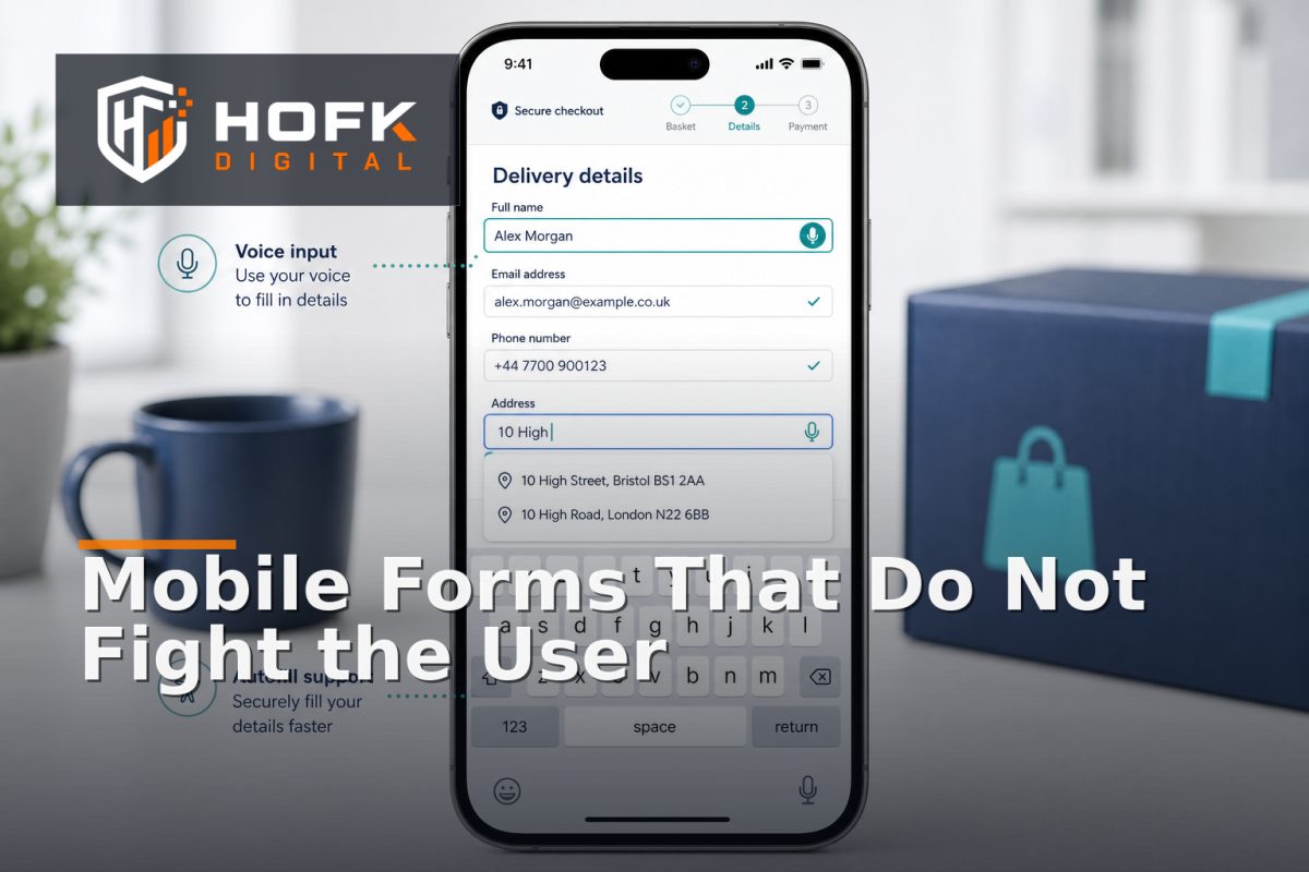
How to Design Mobile Forms That Work with Autofill, Keyboards and Assistive Input
A mobile form can look excellent in a design review and still be frustrating to complete. The browser may suggest the wrong address, the virtual keyboard may cover the next button, focus may jump unexpectedly, or a screen reader may announce a field without enough context.
These problems are rarely caused by one visual mistake. They usually come from treating mobile forms as smaller desktop forms rather than as interactive systems with their own input methods, browser behaviours and accessibility requirements.
Good mobile form UX design helps people enter information quickly, understand what is required, recover from errors and complete the intended action. This matters for lead forms, checkout, account creation, quote requests and internal operational workflows.
Start with the information the form genuinely needs
Before choosing fields or styling the layout, define what the business needs to do after submission. A checkout may need accurate delivery information. A lead form may only need enough detail to route and respond to an enquiry. An account application may need additional verification later in the process.
Separate fields into three groups:
- Required now: information needed to complete the current action.
- Useful later: information that can be collected during qualification or follow-up.
- Optional context: information that may help but should not block submission.
This is the foundation of mobile form optimisation. Every additional field creates typing, scanning and validation effort. If a question does not affect the immediate next step, consider moving it to a later stage.
Use the right HTML input types and autocomplete hints
Browsers and mobile operating systems can reduce effort when they understand what a field represents. Use semantic input types and recognised autocomplete values rather than relying on placeholder text or field names alone.
Examples include:
type="email"for email addresses.type="tel"for telephone numbers.type="url"for website addresses.autocomplete="given-name"andautocomplete="family-name"for names.autocomplete="email"for email addresses.autocomplete="street-address"or more specific address tokens where appropriate.autocomplete="postal-code"for postcodes.autocomplete="organization"for company names.
These attributes do not force every browser to behave identically, but they give the browser useful information. They also improve the chance that a visitor can use stored details rather than typing everything manually.
Do not use autocomplete values simply because they sound relevant. The field meaning must match the value. A field labelled “account reference” should not be marked as a postcode field merely to obtain a convenient keyboard.
Design around the mobile keyboard
The virtual keyboard changes the usable viewport. When it opens, it can cover a submit button, push an error message below the visible area or cause the page to scroll to an unexpected position.
Test each important field while the keyboard is open. Check whether:
- The focused field remains visible.
- The label and help text remain associated with the input.
- The next action can be reached without awkward scrolling.
- The keyboard type suits the expected value.
- Moving to the next field follows a logical order.
For numeric values, consider whether a numeric keyboard genuinely helps. A phone number, postcode and quantity may require different input behaviour. Do not use a numeric input for values that may contain letters, spaces or formatting characters.
For multi-step forms, test the transition after each step. The next button should not disappear behind the keyboard, and the page should not jump so far that the user loses context.
Make focus behaviour predictable
Focus is central to mobile input usability. It tells users where they are working and allows keyboard, switch-control and screen-reader users to navigate the form.
When a field receives focus, avoid unexpected behaviour such as:
- Scrolling the user away from the field.
- Opening a modal without a clear reason.
- Replacing entered content.
- Moving focus to an unrelated element.
- Showing an error before the user has had a reasonable chance to enter a value.
After a validation failure, move focus to a useful place. For a short form, focusing the first invalid field may work well. For a long form, an error summary can help users understand the problem before they navigate to the relevant field.
When a modal, address lookup or date picker opens, focus should move into the new interaction and return sensibly when it closes. VERIFY accessibility acceptance criteria against your current testing process and supported browsers before publication.
Do not rely on placeholders as labels
Placeholders disappear when users start typing and can be difficult to read on small screens. They are useful for examples, but they should not be the only explanation of what a field requires.
Use a persistent label, then add concise supporting text where it helps. For example:
- Label: “Mobile number”
- Help text: “Used only for delivery updates”
This is clearer than placing “Enter your phone number” inside the field and allowing it to vanish as soon as the user taps.
Keep labels short, but do not shorten them so far that their meaning becomes ambiguous. “Address” may be acceptable in a simple form, while a checkout may need to distinguish billing address, delivery address, building name and postcode.
Make autofill helpful without surrendering control
Autofill is useful when it saves effort, but users must be able to review and correct the result. An address suggestion or saved contact detail is not automatically accurate for the current order or enquiry.
A robust form should let users:
- Accept a suggestion quickly.
- Review the completed fields.
- Edit individual values.
- Switch to manual entry if no suggestion is correct.
- Keep entered information after a validation error.
This is particularly important for UK addresses. New developments, flats, rural properties and business premises may not appear exactly as a lookup service expects. HOFK’s existing guidance on checkout address form optimisation covers the balance between lookup convenience and manual address entry in more detail.
Do not silently replace a user’s manually entered address with a normalised version they have not reviewed. If a transformation is necessary for fulfilment, show the resulting address clearly before submission.
Design validation that helps people recover
Validation should explain what happened and what to do next. Generic messages such as “Invalid input” or “There was a problem” make mobile forms harder to recover from.
Useful messages are specific:
- “Enter a valid email address, such as name@example.com.”
- “Choose a delivery address or select manual entry.”
- “This postcode is outside the selected delivery service.”
- “Your payment was not completed. Check the details or choose another method.”
Show errors close to the relevant field, while also providing a summary for longer forms. Do not erase the rest of the user’s information because one field failed. Losing a completed address, enquiry or application can create more frustration than the original validation error.
Support screen readers and assistive input
Assistive input includes screen readers, keyboard navigation, switch controls, voice input, magnification and other methods that do not rely on precise touch interaction. A form that works with a finger is not necessarily accessible.
Check that:
- Every input has a properly associated label.
- Required fields are identified programmatically and visually.
- Error messages are announced or discoverable.
- Instructions do not rely on colour alone.
- Focus order follows the visual and logical order.
- Custom controls expose their name, role and state.
- Autocomplete suggestions can be operated without precise swiping.
Be cautious with custom dropdowns, date pickers and address lookup components. Native controls may be less visually distinctive, but they can provide more dependable behaviour across devices and assistive technologies.
Test the complete form journey, not isolated fields
Responsive form design needs scenario-based testing. Use realistic journeys rather than checking only whether an input accepts a value.
- Open the form on a real mobile device.
- Complete it using browser autofill where available.
- Complete it manually without autofill.
- Trigger an error and correct it.
- Change an earlier answer and confirm dependent fields update.
- Submit with consent accepted and, where relevant, refused.
- Check the confirmation state and the receiving CRM, order system or inbox.
Repeat key tests with a keyboard, screen reader or other assistive method where your team supports those users. Record what the user sees, what the browser submits and what the connected system receives.
A practical mobile form UX design checklist
- Only fields needed for the immediate decision are required.
- Semantic input types and appropriate autocomplete values are used.
- The virtual keyboard does not cover the active field or next action.
- Focus moves predictably through the form.
- Labels remain visible and meaningful after input.
- Autofill suggestions can be reviewed and corrected.
- Validation messages explain how to recover.
- Entered values are preserved after errors and state changes.
- Screen readers and assistive input can identify fields, errors and controls.
- The complete form-to-CRM, order or enquiry journey has been tested.
Where HOFK can help
Mobile forms often sit between responsive templates, ecommerce platforms, CRM systems, analytics, consent tools and operational workflows. HOFK can help review the journey, improve the implementation or build the full stack logic behind more reliable forms.
Relevant support may include mobile-ready design, ecommerce, full stack development and SEO & Google Ads support where form performance affects campaign measurement and lead quality. The objective is not to add more fields or more automation. It is to make the form easier to complete and the submitted information more dependable.
Conclusion
Effective mobile form UX design treats autofill, keyboards, focus, validation and assistive input as part of the form itself. Start with the information the business genuinely needs, use semantic fields, preserve state, make errors recoverable and test the journey on real devices.
When mobile form optimisation is approached this way, responsive form design becomes more than a layout exercise. It becomes a practical improvement to mobile input usability, accessibility and commercial performance. If your forms still lose values, hide errors or behave differently across devices, audit the complete interaction before assuming the platform needs replacing.
Frequently asked questions
What is mobile form UX design?
Mobile form UX design is the planning and implementation of form interactions for phones, including field order, labels, keyboards, autofill, validation, focus and assistive input.
How can autofill improve mobile form optimisation?
Correct input types and autocomplete values allow browsers to suggest stored information, reducing typing. Users should still be able to review, edit or enter details manually.
Why do mobile keyboards cause form problems?
The virtual keyboard reduces the visible viewport and can cover buttons, error messages or the next field. Forms should be tested while the keyboard is open and after focus changes.
What should accessible mobile forms support?
They should support clear labels, logical focus order, programmatically identified errors, keyboard navigation, screen readers, switch controls and other assistive input methods.
How should mobile forms be tested before launch?
Test realistic journeys on real phones, including autofill, manual entry, validation errors, dependent fields, consent states, keyboard behaviour and the final CRM, order or enquiry handoff.