

How to Audit the Mobile Hero Section on Landing Pages for Tap Priority and Clarity
If you are working on mobile landing page optimisation, do not start with the full page. Start with the first screen. On mobile, the hero section is often the only part a user sees before deciding whether to tap, scroll or leave. If the first screen is cluttered, unclear or awkward to use with one thumb, the page has already lost momentum.
This article is deliberately narrow. It looks only at the mobile hero block on ecommerce and lead-gen landing pages: the headline, subhead, primary call to action, supporting trust cues, imagery and any sticky CTA behaviour that affects the first interaction. That focus matters because a hero section can look fine in a desktop design review and still fail badly on a real phone.
For UK business owners, marketers, founders and ecommerce teams, a useful hero audit is less about design taste and more about tap priority. What should the user notice first? What should they tap first? What should they not have to fight through?
What the mobile hero section is supposed to do
The mobile hero section has one job: help the user decide whether this page is worth a tap, a scroll or a purchase. It is not the place to explain everything. It is the place to make the offer obvious and the next action easy.
On a phone, the hero is doing several jobs at once:
- confirming the user is in the right place
- showing the offer or product clearly
- directing attention to one primary action
- providing just enough reassurance to keep going
If any of those jobs are muddled, the first screen becomes a friction point. That can affect both ecommerce and lead-gen pages, even when the rest of the page is well built.
Start with tap priority, not visual balance
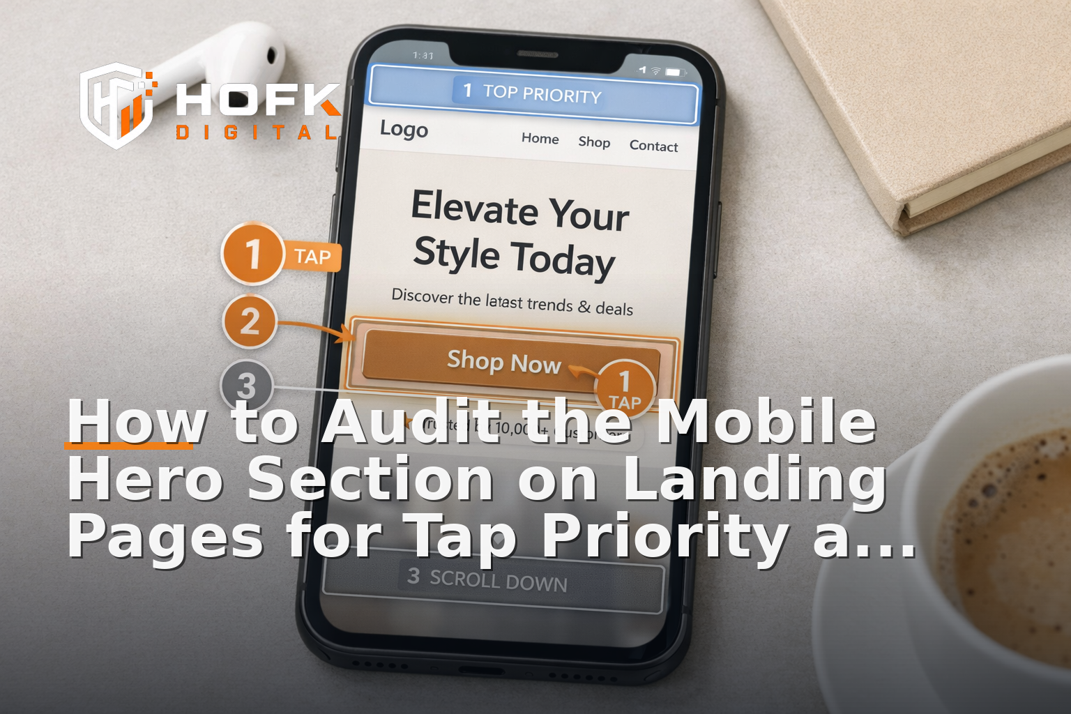
Many teams review mobile hero sections as if they were posters. That is the wrong lens. A hero section on mobile is not just something to look at. It is something to use.
Tap priority means the most important action should be the easiest one to find and the easiest one to hit. If the user can see three or four competing taps before they understand the primary offer, the hierarchy is too noisy.
Ask these three questions
- What is the first tap you want the user to make?
- Can that tap be reached comfortably with one thumb?
- Are there any less important taps competing with it?
Examples of competing taps include secondary links, social icons, menu triggers, carousel dots, category shortcuts, promo badges and close buttons on overlays. Some of these may be useful elsewhere on the page, but they should not distract from the hero’s primary action.
Check the content hierarchy in the first screen
Clarity on mobile depends on order. If the hero section does not clearly separate the message from the supporting detail, the user has to work too hard to understand it.
A sensible first-screen hierarchy is usually:
- Main headline — what is this page offering?
- Supporting line — why does it matter, and for whom?
- Primary CTA — what should the user do next?
- Trust cue — why should they believe or continue?
That order may shift slightly for ecommerce and lead generation, but the principle is the same. The primary action should not sit below a block of decorative text. The user should not have to guess what the page is about before they can act.
Signs the hierarchy is weak
- the headline is too generic to identify the offer
- the support copy repeats the headline without adding meaning
- the CTA is visually present but not prominent
- the image takes priority over the message
- the first screen contains two or more messages that feel equally important
If those problems show up, the hero section is not giving the user a clean route through the page.
Audit the headline for instant recognition
The headline is the anchor point for the entire hero block. In mobile landing page optimisation, it should do more than sound polished. It should help the visitor recognise the page quickly.
A good mobile headline usually says what the page is, who it is for, or what problem it solves. A weak headline tries to be clever, brand-led or broad.
For example:
- Weak: Smarter choices for busy teams
- Better: Inventory software for growing ecommerce teams
- Weak: Built around your future
- Better: Book a free audit of your Google Ads account
The point is not to make headlines dull. It is to make them useful. On a phone, users do not have patience for ambiguity.
Make the CTA easy to tap and hard to miss
The primary CTA is often the most important element in the hero section. It should be obvious, large enough to tap comfortably, and clearly connected to the page promise.
In responsive landing pages, CTA problems are often not about design quality. They are about placement, spacing and label choice.
What to check in the CTA
- Is the label specific enough?
- Is there enough space around it for a clean tap?
- Does it sit high enough to be seen without scrolling?
- Does it still stand out if the image or background is busy?
- Does it look like the obvious next step, not one option among many?
Useful CTA labels tend to describe the outcome: Get a quote, Book a demo, Shop the range, Check availability, Request a callback. Labels such as Learn more or Submit can be too vague for a first-screen action, especially when traffic is coming from ads or a specific campaign.
Test sticky CTA behaviour carefully
A sticky CTA can help mobile users keep the next step visible, but it can also become a nuisance if it obscures the hero or repeats the wrong action.
For the first screen, the key question is not whether the sticky CTA exists. It is whether it improves tap priority without stealing attention from the main message.
Good sticky CTA behaviour
- appears only when it genuinely helps the journey
- does not block the headline, image or trust cue
- uses the same label or meaning as the main CTA
- feels like a support tool, not a competing banner
Common sticky CTA problems
- it appears too early and crowds the hero
- it hides key text on smaller phones
- it creates two identical calls to action at once
- it uses a different message from the main button
If the sticky CTA changes the balance of the first screen, the hero section needs another look. A useful mobile UX best practice is to make sure the page still works when the sticky element is ignored, delayed or hidden.
Check the visual order of image, text and button
The order of content in the hero section matters more on mobile than on desktop. A layout that feels balanced on a wide screen can become confusing once it is stacked vertically.
Ask what appears first, what appears second and what appears last. Then ask whether that order supports the decision you want the user to make.
In many cases, the image should support the message, not compete with it. That does not mean hero imagery is bad. It means the image should not make the headline harder to read or push the CTA below the fold without purpose.
For ecommerce pages, product imagery may be central. For lead-gen pages, proof or branding imagery may matter more. Either way, the hierarchy should still be intentional.
Things to watch for on small screens
- text sitting on top of a busy image
- important text getting cropped by the viewport
- buttons pushed too low by oversized graphics
- fonts that look fine in design files but feel tight on real phones
This is where responsive landing pages can look correct in a browser preview but still feel wrong in practice. Always check the actual stacking order on a real device where possible.
Visible trust cues should support the first decision
A mobile hero section does not need a full trust section, but it usually benefits from one simple reassurance cue. That might be a review snippet, a short service qualifier, a client indicator, delivery detail, or a line that explains why the page is credible.
The trust cue should be visible enough to help, but light enough not to crowd out the CTA. On the first screen, trust works best when it is concise and specific.
Examples of useful trust cues
- Ecommerce: Free UK delivery over a threshold, easy returns, or customer rating
- Lead gen: UK-based support, transparent pricing, or no-obligation consultation
- Service pages: Clear turnaround times, sector focus, or a short proof point
The best trust cues answer the silent question: why should I continue here? If the hero section contains badges that are decorative rather than meaningful, they should probably be removed or moved lower down.
Use the hero section to reduce uncertainty, not add it
A common mistake in mobile landing page optimisation is trying to cram too much into the hero. The result is a block that technically contains everything, but tells the user nothing quickly.
A strong first screen usually removes doubt in three ways:
- it says what the page is about
- it makes the next action obvious
- it adds just enough reassurance to keep going
If the hero section includes extra links, rotating banners, multiple product choices or too much supporting text, it may be solving a content problem by creating a clarity problem.
A practical first-screen audit checklist
If you need a quick diagnostic for a live landing page, review the mobile hero section against this checklist:
- Is the offer obvious within a few seconds?
- Does the headline clearly identify what the page is for?
- Is the primary CTA the easiest thing to tap?
- Are there any competing taps above the fold?
- Does the sticky CTA help rather than crowd the hero?
- Is the image supporting the message instead of dominating it?
- Is there a visible trust cue that feels useful, not decorative?
- Does the mobile stack feel deliberate on a real phone?
If you cannot answer yes to most of those, the first screen probably needs refinement before you spend more time improving later sections of the page.
When the hero issue is really a build issue
Sometimes the problem is not the content itself. It is the way the template is built. If the mobile hero keeps breaking, cropping badly, or losing tap priority every time a campaign changes, the underlying structure may be too rigid.
That is where practical front-end and full stack support can help. HOFK often works with businesses that need more than a visual tidy-up: clearer landing page structure, better responsive behaviour, improved page speed, and cleaner measurement around the actions that matter. If your hero block needs to be easier to maintain across campaigns, the fix may sit in the template rather than in another round of design tweaks.
For teams also running paid traffic, that kind of support can sit alongside SEO & Adwords work, especially where ad relevance and landing page clarity need to align quickly.
Why this matters for ecommerce and lead generation
For ecommerce teams, the hero section often determines whether the shopper reaches the product or bounces before the page has a chance to explain the range. For lead-gen pages, it often decides whether the visitor trusts the offer enough to tap the form or phone button.
In both cases, the first screen is a conversion bottleneck. Improving it can be a practical way to support mobile landing page optimisation without redesigning the whole site.
That is especially relevant for businesses that already have traffic, but suspect the mobile experience is causing preventable loss. Small changes to hierarchy, tap priority and trust cues can make the page easier to use without changing the underlying offer.
Conclusion
If you only audit one part of a landing page on mobile, audit the hero section. The first screen is where tap priority, clarity and trust either work together or get in each other’s way. A good hero block makes the offer obvious, the next action easy and the page worth continuing.
That is the heart of practical mobile landing page optimisation: not more decoration, but better first-screen decisions. If your mobile hero needs clearer hierarchy, stronger responsive behaviour, or cleaner CTA handling, HOFK can help with mobile-ready design, ecommerce, full stack development and the technical detail behind responsive websites that need to convert well on real phones.
Frequently asked questions
What is the mobile hero section on a landing page?
It is the first screen a visitor sees on a phone, usually including the headline, supporting copy, CTA, imagery and any trust cue that appears above the fold.
What should I check first in mobile landing page optimisation?
Start with the first screen. Check whether the offer is clear, the CTA is easy to tap and the hierarchy supports the action you want the user to take.
Should a mobile hero section include a sticky CTA?
Only if it helps the journey. A sticky CTA should support the first-screen action, not compete with it or hide important content.
What makes a good trust cue in the hero section?
A good trust cue is short, specific and relevant. It might mention delivery, returns, UK support, review ratings or a service qualifier that helps the user continue.
Can a hero section hurt conversion even if the rest of the page is good?
Yes. If the first screen is confusing, cluttered or hard to use on mobile, many users will leave before they reach the rest of the page.