

How to Plan Responsive Image Art Direction Without Slowing Down Mobile Pages
A wide desktop hero image can look polished on a large screen and become almost useless on a phone. The subject may be cropped out, the headline may sit over a busy area, or the image may load as a large file even though most mobile visitors only see a small part of it.
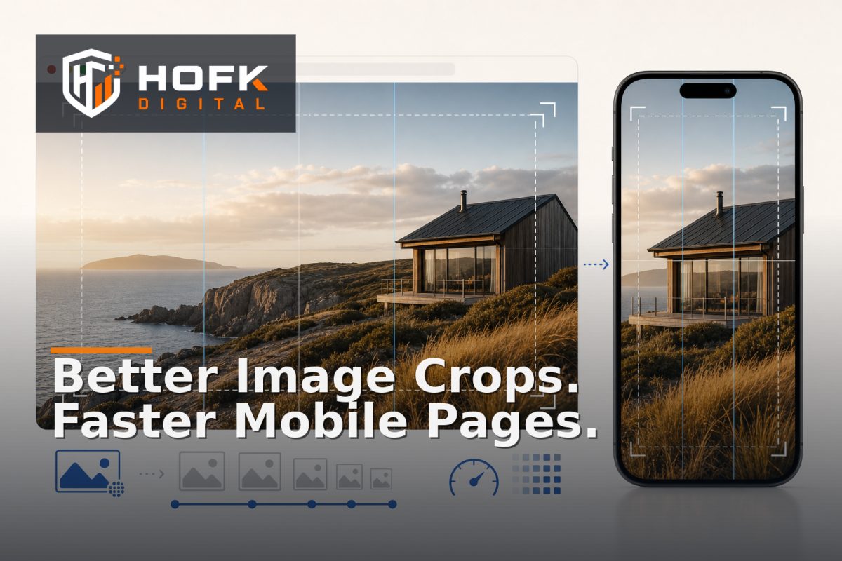
This is where responsive image art direction becomes useful. It is the process of deciding whether an image should use a different crop, composition or source asset at different viewport sizes, rather than simply shrinking the same image everywhere.
Good art direction is not an excuse to add several heavy images to every page. It should help the image communicate the right message on each device while supporting mobile image optimisation and reliable frontend image performance. This guide explains how UK marketing and frontend teams can plan that balance before design and development work begins.
What responsive image art direction means
Responsive images and responsive image art direction are related, but they solve different problems.
Responsive images usually mean serving an appropriately sized version of the same image. A browser may receive a smaller file on a narrow screen and a larger file on a desktop screen. The subject and composition remain broadly the same.
Art direction is different. It allows the design to use a deliberately different crop or source image at a particular breakpoint. For example:
- A landscape product photograph becomes a tighter portrait crop on mobile.
- A desktop campaign image showing a team across a wide office becomes a closer image of one person using the service.
- A product bundle is rearranged so the main item remains recognisable in a narrow card.
- Text is moved away from a busy background area in the mobile composition.
The decision should be based on communication and usability, not simply on the fact that a mobile crop is technically possible.
Start with the page job and image job
Before requesting alternative crops, define what the page and image need to achieve. An image on a homepage hero may need to establish relevance quickly. A product image may need to show the item accurately. A service-page image may support trust or explain a process.
Write the image job in one sentence. For example:
- Help a mobile visitor recognise that this service is relevant to warehouse and operations teams.
- Show the complete product and its key physical feature without relying on the surrounding copy.
- Support a seasonal campaign without obscuring the promotional message.
If the image has no clear job, creating several art-directed versions is unlikely to improve the page. The team may simply create more assets to maintain.
When a different crop is justified
Responsive image art direction is most useful when the same composition does not survive the change in screen shape. Look for a genuine communication problem rather than a preference about how the page looks.
The subject disappears
A wide image may place the important subject near the edge of the frame. On mobile, a centred crop could remove it completely. A different crop is justified if the visitor can no longer understand what the image represents.
The subject becomes too small
Some images contain several people, products or objects that work together on desktop. On a phone, they may become tiny details that add visual noise rather than meaning. A closer mobile composition may communicate the same idea more effectively.
Text and image compete
Hero images often have a quiet area reserved for text. If the layout changes on mobile and the text moves, that quiet area may no longer exist. A mobile-specific crop can protect readability without adding a heavy overlay.
The buying decision needs a different view
For ecommerce, a desktop image may show the full range or a lifestyle scene, while a mobile image may need to prioritise the product detail that helps the customer choose. Do not use an art-directed crop to hide an important limitation or make the product appear different from what will be supplied.
When a different crop is not justified
Not every image needs separate art direction. Additional assets create costs for photography, design, storage, CMS management, testing and future updates.
A single responsive image may be sufficient when:
- The subject remains clear at every supported width.
- The image is decorative and does not carry important information.
- The crop remains acceptable even if some background detail is removed.
- The page already communicates the key message clearly through text and layout.
- The extra mobile asset would create more maintenance work than customer value.
Use a different crop because the experience needs it, not because a design review favours visual variety.
Build an art direction decision matrix
A short decision matrix helps marketing, design and frontend teams reach the same conclusion. For each important image, record:
- Image role: hero, product, category, editorial, proof or decorative.
- Primary subject: the person, product or detail that must remain visible.
- Desktop composition: what the wide layout is designed to show.
- Mobile risk: what may disappear, become too small or compete with text.
- Required treatment: same image, alternate crop, alternate source or no image.
- Text relationship: whether copy overlays the image or sits separately.
- Owner: who approves the crop and who maintains it later.
This matrix is particularly useful during a CMS or responsive website project because it prevents image decisions being made separately by each page owner.
Plan image sources around real breakpoints
Do not create a separate asset for every device width. Start with the layout changes that matter. A desktop composition, an intermediate composition and a mobile composition may be enough, although the correct number depends on the design system and image roles.
Use breakpoints based on layout behaviour rather than device brand names. For example, the crop may need to change when:
- The hero switches from a side-by-side layout to a stacked layout.
- The text moves from beside the image to over the image.
- A product card changes from horizontal to vertical.
- A comparison or category grid reduces the available image width substantially.
VERIFY the final breakpoint strategy against the website's design system, analytics and supported browser policy. The goal is to create stable rules that the frontend team can maintain, not a long list of device-specific exceptions.
Separate art direction from image delivery
A different crop does not automatically mean a large performance problem. Performance depends on how the assets are generated, selected, compressed and delivered.
For each art-directed image, plan:
- Several sensible output widths rather than one oversized file.
- Modern formats where the current browser and platform setup support them.
- Appropriate compression for the image type and role.
- Lazy loading for below-the-fold images.
- Priority loading for the main above-the-fold image where appropriate.
- Dimensions or aspect-ratio rules that reduce layout shifts.
The frontend should select the appropriate source for the layout and viewport. It should not download every crop and hide the unwanted versions with CSS. That approach can undermine mobile image optimisation by transferring assets the visitor never sees.
Choose the right implementation pattern
The implementation will depend on the site stack and CMS, but the principle is consistent: the browser should receive the image source that matches the current layout.
For the same composition at different sizes, responsive image features such as srcset and sizes may be appropriate. For genuinely different crops, a picture-based source selection pattern may be more suitable. A CMS may also need named focal points or separate mobile and desktop fields.
Do not hard-code the decision into one campaign template if several teams will need it later. A reusable image component should make the approved source relationship clear to editors and developers.
VERIFY the exact implementation against the current CMS, frontend framework, CDN and browser support requirements before release. The technical pattern should fit the systems HOFK or your internal team will maintain.
Protect frontend image performance during testing
Test the image in the conditions customers actually use, not only on a fast development connection. Compare mobile and desktop versions for:
- First visible render and perceived loading speed.
- Largest above-the-fold image behaviour.
- Layout stability while the image loads.
- Sharpness and cropping on high-density displays.
- Behaviour when the image fails or loads slowly.
- Impact from consent tools, chat widgets and other overlays.
Use browser performance tools and real devices where possible. A compressed image can still feel slow if it is requested too early, while a visually smaller asset can still be wasteful if the source file is far larger than the rendered area.
Test real content and difficult compositions
Placeholder images rarely expose art direction problems. Test the longest realistic headline, the busiest image background, the tallest product name and the most important campaign badge.
Include scenarios such as:
- A mobile hero with a long translated or revised headline.
- A product image where the key feature sits near the crop edge.
- A category card with a portrait-oriented source image.
- A missing mobile asset that should fall back safely.
- A CMS editor replacing the desktop image without updating the mobile crop.
Visual regression checks can help identify unexpected crop changes after releases. HOFK's guide on adding visual regression checks to a website release process covers baselines, responsive coverage and diff triage. The specific art-direction question is whether the difference is intentional and still supports the page job.
Create an approval and maintenance rule
Every additional crop becomes a content asset that someone must own. Define who approves the composition, who can replace it, and what happens when the underlying campaign or product changes.
A useful approval record can include:
- Source image or photography reference.
- Approved desktop and mobile crops.
- Focal subject and any protected area.
- Pages and components using the asset.
- Alt text or related content requirements.
- Approval date and owner.
- Review date for temporary campaign imagery.
Do not rely on filenames such as hero-final-mobile-new-2.jpg to explain the relationship. The CMS or asset register should make the relationship visible.
Responsive image art direction checklist
Before approving a responsive image system or campaign page, confirm that:
- Each important image has a defined job.
- Alternative crops are created only where the composition needs them.
- The primary subject remains visible at supported widths.
- Text and image areas remain readable together.
- Sources are selected by layout and viewport rather than hidden after download.
- Images have appropriate dimensions, compression and loading priority.
- Fallback behaviour is defined when an alternate crop is missing.
- Real mobile devices and difficult content have been tested.
- Visual changes have an owner and approval record.
- Performance checks are included in the release process.
Where HOFK can help
Responsive image work often crosses content planning, CMS configuration, responsive website implementation, ecommerce templates, SEO and monitoring. HOFK can help review the asset model, improve the frontend component, connect image data more reliably or add practical performance and release checks.
Relevant support may include mobile-ready design, ecommerce, full stack development and SEO & Adwords support where campaign landing pages and organic journeys need to remain consistent. The aim is not to create more image variants for their own sake. It is to make the important visual message clearer without adding avoidable page weight.
Conclusion
Responsive image art direction works best when it starts with the communication job of the image. Decide whether the subject, crop, text relationship or buying context genuinely changes between layouts. Then create only the alternative assets that solve a real problem.
Separate crop decisions from image delivery, select sources that match the layout, test difficult content on real devices and give every approved asset an owner. That approach supports responsive images, sensible mobile image optimisation and stronger frontend image performance without turning the CMS into an unmanaged collection of near-duplicates.
If your mobile pages are slow, visually unclear or difficult to maintain after image changes, HOFK can help review the content model, responsive implementation and performance controls behind them.
Frequently asked questions
What is responsive image art direction?
Responsive image art direction is the planned use of different image crops or source assets at different layout sizes so the subject and message remain clear on each device.
Is art direction the same as responsive images?
No. Responsive images usually deliver different sizes of the same composition. Art direction can deliver a deliberately different crop or image where the composition needs to change.
Does using mobile and desktop crops slow down a website?
Not necessarily. The implementation should request only the relevant source and size for the current layout. Downloading every crop and hiding the unused versions would create avoidable weight.
When should a mobile crop be created?
Create one when the desktop composition hides the subject, makes it too small, conflicts with mobile text or fails to support the page's buying or communication goal.
How should responsive image art direction be tested?
Test real content on representative mobile and desktop widths, including long headlines, difficult subjects, slow loading, missing assets, overlays and post-release visual comparisons.