

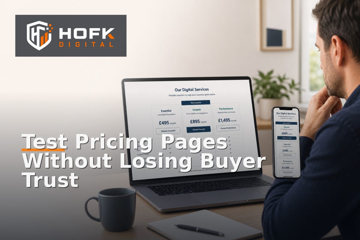
How to Test Pricing Page Layouts Without Confusing High-Value Buyers
A pricing page for a £20 purchase can be tested with relatively little explanation. A pricing page for a high-value B2B service is different. Buyers may need to understand scope, risk, implementation effort, payment terms and what happens if their requirements do not fit neatly into one package.
That makes pricing page conversion testing more delicate. A layout that produces more form submissions may also create weaker enquiries, make the service appear less credible or encourage buyers to compare prices before they understand what is included.
The aim is not to avoid testing. It is to test in a way that protects buyer confidence while producing useful evidence. This guide explains how UK B2B founders and marketing managers can run pricing page CRO experiments without turning a considered purchase into a confusing interface.
Why high-value pricing pages need a different testing approach
High-value service buyers rarely make a decision from one number alone. They may be comparing providers, preparing an internal business case or trying to understand whether a supplier can handle a complex requirement.
On these pages, the layout needs to answer several questions at once:
- What is the service and who is it suitable for?
- What does each package or pricing route include?
- What is fixed, estimated or dependent on discovery?
- What happens when a buyer has requirements outside the standard options?
- What should the visitor do next?
If an experiment makes these answers less clear, a higher click-through rate may not represent a better commercial outcome. A buyer might click a package because it looks cheaper, then submit an unsuitable enquiry or leave after discovering that important requirements were excluded.
Define the buyer decision before changing the layout
Before creating variants, write down the decision the pricing page should support. This prevents the test becoming a visual preference exercise.
For some businesses, the page should help a visitor choose between three defined packages. For others, it should help a prospect decide whether to request a tailored discussion. A technical consultancy may need to show starting points without pretending that a complex project can be priced from a single table.
Write the intended decision in one sentence, such as:
- Help suitable buyers identify the most relevant service route.
- Help prospects understand which factors affect the eventual price.
- Give smaller projects a clear starting point while routing complex requirements to consultation.
- Reduce uncertainty about what happens after a pricing enquiry.
This sentence becomes the reference point for the experiment. A layout should not be judged only by whether it creates more interaction. It should be judged by whether it helps the right buyer take the right next step.
Choose the pricing page element to test
Testing too many variables at once makes the result difficult to interpret. Start with one meaningful layout question.
Package hierarchy
Compare whether the page should lead with a recommended package, a simple list of options or a starting-price message followed by a consultation route. This can affect how quickly buyers understand the available choices.
Comparison table versus service cards
A table may help buyers compare scope across packages, while cards may feel easier to scan on mobile. Test the format only when the underlying information remains equivalent and accessible.
Price-first versus value-first structure
A price-first layout makes the commercial information prominent. A value-first layout explains the problem, process or inclusions before showing the price. The right choice may depend on how familiar the audience is with the service.
Fixed package versus tailored route
You can test whether a tailored consultation option appears alongside packages or after them. Do not hide the route for complex buyers simply to push more visitors towards a standard option.
Use a control and a focused variant
A useful pricing page CRO test normally starts with the current page as the control and one clearly defined alternative. The control should be documented before the test begins, including the layout, copy, calls to action, package order and form route.
The variant should change one main hypothesis. For example:
Hypothesis: placing a short explanation of scope above the pricing table will increase qualified enquiries because buyers can understand the difference between packages before comparing the figures.
That is stronger than a vague hypothesis such as “a cleaner design will convert better”. It identifies the audience concern, the layout change and the expected business outcome.
If two variants are materially different, record the differences clearly. A pricing table conversion result is difficult to interpret when the test also changes the headline, testimonials, form length and package names.
Protect clarity when presenting prices
High-value buyers need pricing information to be understandable, but clarity does not mean reducing a complex service to a single headline figure.
For each price or package, explain:
- Whether it is a fixed price, starting price, estimate or typical range.
- What is included at that level.
- What is excluded or likely to require further scoping.
- Which type of customer or project the option suits.
- What happens after the visitor selects the route.
A starting price without context can create the wrong expectation. Equally, hiding every price behind “contact us” can make a suitable buyer feel that the business is avoiding transparency. The test should explore how much information buyers need to take a confident next step, not simply whether the largest figure attracts attention.
Test the mobile layout separately
Pricing tables that look acceptable on desktop can become difficult to compare on a phone. Columns may require horizontal scrolling, package differences may be separated vertically, and important qualifiers may appear far below the call to action.
During pricing page conversion testing, review each variant on real mobile devices where possible. Check:
- Whether the package names remain visible while comparing features.
- Whether prices and billing terms are easy to associate with the right option.
- Whether the primary action is reachable without excessive scrolling.
- Whether accordions hide information needed for the decision.
- Whether sticky elements cover prices, inclusions or form fields.
Responsive service website structure can influence conversion substantially because mobile visitors may need answers quickly. HOFK’s guide to structuring a responsive service website for mobile users provides related principles around hierarchy, practical information and contact routes.
Do not judge the test by form volume alone
For a high-value service, a form submission is an early signal rather than the final outcome. A layout may create more enquiries by making the offer appear cheaper or easier than it really is. That does not necessarily mean it is commercially stronger.
Use a measurement set that reflects the sales process:
- Pricing page visits and engagement.
- Package or pricing-route selections.
- CTA clicks and form starts.
- Completed enquiries.
- Qualified enquiry rate.
- Sales acceptance or discovery-call bookings.
- Disqualification reasons.
- Opportunity creation and progression where data is available.
Label estimates clearly. If a test is too small to show a reliable difference, describe the result as directional rather than claiming a definite winner.
Use qualitative feedback to explain the numbers
Analytics can show that one layout received more clicks. It may not explain whether buyers understood the options or simply clicked because a button was more prominent.
Ask a small sample of recent prospects or sales colleagues:
- Was it clear what each option included?
- Did the pricing feel credible for the service?
- What information was missing before making contact?
- Was the tailored route easy to find?
- Could the buyer explain the options to another decision-maker?
Keep the questions neutral. Do not tell participants which variant the team prefers. Qualitative feedback is particularly valuable where traffic volumes are too low for a reliable statistical test.
Set guardrails before the experiment starts
Agree what would make you pause or reject a variant before reviewing the results. Guardrails prevent a small increase in conversion from hiding a serious decline in lead quality or buyer understanding.
Possible guardrails include:
- Do not keep a variant if qualified enquiries fall materially.
- Pause the test if buyers repeatedly misunderstand package scope.
- Review any increase in price objections or unsuitable enquiries.
- Check that mobile users can still compare options clearly.
- Do not make a permanent change from a very small sample.
If the page has a technical issue, such as an incorrect price, broken form state or inconsistent package display, treat it as a release defect rather than a CRO finding. HOFK’s guide to diagnosing a conversion-rate drop after a price increase covers the importance of checking tracking, pricing consistency and traffic quality before drawing conclusions.
Run the experiment in stages
A staged approach is often safer for high-value services than exposing every visitor to a major layout change immediately.
- Review the existing page and define the buyer decision.
- Test the layout internally on desktop and mobile.
- Run a limited experiment or targeted campaign segment.
- Review interaction data and the quality of resulting enquiries.
- Gather sales and prospect feedback.
- Expand the variant only if it meets the agreed guardrails.
Where traffic is limited, a documented before-and-after comparison may be more realistic than a formal A/B test. The important point is to make one meaningful change at a time and record what was learned.
Pricing page conversion testing checklist
- Define the buyer decision the page should support.
- Write one clear layout hypothesis.
- Keep the control and variant differences documented.
- Explain prices, inclusions and exclusions honestly.
- Test tables, cards and CTAs on real mobile devices.
- Measure qualified enquiries, not only form submissions.
- Connect outcomes to CRM or sales stages where possible.
- Use qualitative feedback to explain the data.
- Agree pause and success criteria before launch.
- Document the result and the next decision.
Conclusion
Effective pricing page conversion testing for high-value B2B services is not about making the cheapest-looking option the most prominent. It is about helping the right buyer understand the offer, compare routes confidently and take an appropriate next step.
Start with the buyer decision, test one meaningful layout hypothesis, protect price and scope clarity, and review qualified outcomes alongside conversion rate. Use mobile checks, sales feedback and clear guardrails before making a permanent change.
If your pricing page needs stronger measurement, responsive implementation or a more structured pricing page CRO process, HOFK can help with responsive websites, ecommerce, SEO and Google Ads support, full stack development and practical conversion-focused improvements.
Frequently asked questions
What is pricing page conversion testing?
It is the structured testing of pricing-page layouts, content hierarchy and calls to action to understand which version helps the right buyers progress without weakening trust or lead quality.
Should a high-value service always show prices?
Not always. Some services can show fixed packages or starting prices, while complex work may need a consultation route. The important point is to explain what the displayed figure means.
What should I measure during a pricing page CRO test?
Measure engagement, CTA clicks, form starts, completed enquiries, qualified enquiry rate, sales acceptance and opportunity progression where possible. Do not rely on form volume alone.
How can I test a pricing table on mobile?
Use real phones to check whether package names, prices, inclusions and calls to action remain associated and easy to compare. Test horizontal scrolling, stacked cards and expandable sections carefully.
What if there is not enough traffic for an A/B test?
Use a staged before-and-after test supported by sales feedback, prospect interviews and qualified enquiry reviews. Treat small samples as directional evidence rather than statistical proof.