

How to Design Mobile Navigation for Service Websites with Multiple Audiences
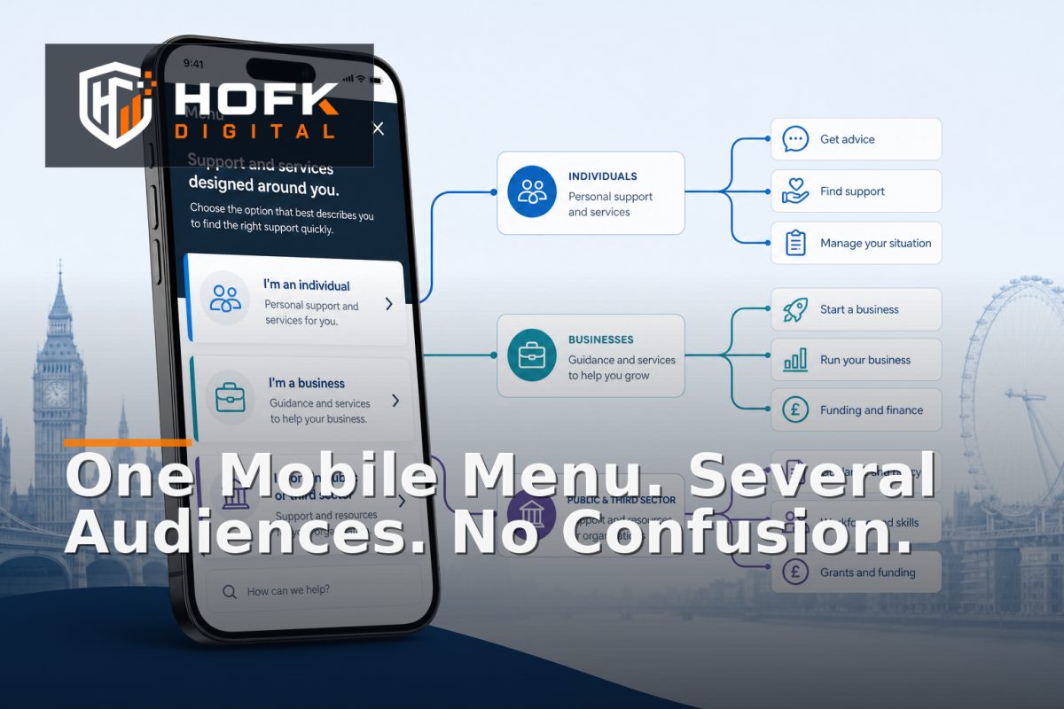
A service website can serve several audiences at once: homeowners and commercial buyers, small businesses and enterprise teams, different sectors, or customers in multiple regions. On desktop, it may be possible to show those routes across a wide header. On mobile, the same structure can become a crowded menu that makes every visitor work out where they belong.
Good mobile service website navigation does not try to show every possible route immediately. It helps each visitor identify the right path quickly, while keeping the overall structure understandable for everyone else.
This guide explains how to design mobile navigation for a multi-audience service website. It covers audience tasks, menu structure, shared and specialist routes, labels, audience selectors, testing and the information architecture decisions that should happen before development.
Start with audience tasks, not organisational departments
Many service websites begin with internal categories such as Services, Sectors, Locations, Resources and About. Those categories may reflect how the business is organised, but they do not always reflect how visitors arrive or what they need to decide.
Before designing the menu, list the main tasks each audience needs to complete. For example:
- Understand whether the business offers the required service.
- Check whether the provider works with a particular sector or customer type.
- Confirm geographic coverage.
- Understand the process, timescale or next step.
- Request a quote, book a consultation or contact the right team.
Then compare those tasks across audiences. Some will be shared. Others will be specific to one group. This distinction gives you a stronger foundation for service website information architecture than starting with a list of pages.
Define the audiences clearly enough to influence navigation
Not every difference between visitors deserves its own menu route. An audience should normally receive a dedicated pathway only when its needs, language, proof or next action are meaningfully different.
Useful audience distinctions might include:
- Consumer and business customers.
- Small organisations and enterprise buyers.
- Different industries with different compliance or operational questions.
- Different locations with separate coverage or contact arrangements.
- New customers and existing account holders.
Be cautious about creating audience routes based only on internal sales categories. If two groups read the same service pages, need the same proof and use the same enquiry form, separating them in the main navigation may add complexity without helping visitors.
A useful test is to ask: what would this audience need to see or do differently? If the answer is unclear, keep the route shared until stronger evidence emerges.
Choose whether audiences belong in the main menu
There are several ways to handle multiple audiences on mobile. The right choice depends on how different the journeys really are.
Shared service-first navigation
Use this when most visitors begin by looking for a service. The menu leads with the services, then provides sector, location or audience content as supporting routes.
This can work well for businesses where the same service is delivered to several customer types and the core explanation does not change significantly.
Audience-first navigation
Use this when the service, proof, pricing approach or process differs substantially by audience. A visitor might choose “For homeowners”, “For businesses” or “For property managers” before seeing the most relevant service options.
This approach can reduce irrelevant content, but it adds an extra decision. The audience labels therefore need to be familiar and easy to understand.
Hybrid navigation
A hybrid structure can show priority services first while also offering a clear “Who we help” route. This is often a practical compromise for larger service businesses.
The risk is duplication. If the same services appear under Services, Sectors and audience menus, visitors may not know which route is authoritative. Define the purpose of each route before building it.
Keep the mobile menu shallow
Mobile users should not need to open several nested levels before reaching a relevant service. A deep menu increases memory load and makes it harder to understand where a link belongs.
A practical mobile structure might include:
- Services – the main service routes.
- Who we help – audience, sector or use-case pathways.
- Locations – only where location changes the service or contact route.
- How it works – process, expectations and next steps.
- About and proof – experience, case studies or credentials.
- Contact – a clear route to enquiry, phone or booking.
This is a starting point, not a universal template. The important principle is to keep the first level focused on the decisions visitors actually need to make.
Use labels that describe visitor value
Menu labels should help people predict what they will find. Internal terms, abbreviations and vague labels can create unnecessary hesitation.
For example, “Solutions” may be less clear than “Services”. “Markets” may be less obvious than “Industries we support”. “Engage” may be less useful than “Contact us” or “Request a quote”.
Good mobile website menu design uses labels that are:
- Short enough to scan on a phone.
- Specific enough to distinguish one route from another.
- Written in the language customers use.
- Consistent with headings and calls to action on the destination pages.
Test labels with people who were not involved in creating the site. Ask what they expect to find after selecting each item. If the answer differs significantly from the intended destination, the label needs work.
Give priority actions a route outside the menu
The main mobile menu should not carry every important action by itself. If the business relies on calls, quote requests, bookings or urgent enquiries, make the relevant action easy to reach without opening several menu layers.
Possible patterns include:
- A persistent but restrained “Get a quote” button.
- A phone link for audiences with urgent requirements.
- A “Book a consultation” action on high-intent service pages.
- A contact shortcut in the header or at the end of the open menu.
Do not create several competing fixed buttons. One primary action is usually easier to understand than a row of floating controls. Test whether the shortcut supports the page's purpose or simply covers content on smaller screens.
Use audience pathways without trapping visitors
An audience selector can be helpful when the website has substantially different content for each group. However, it should not force visitors into a permanent route before they understand the business.
Allow visitors to move between relevant audiences where appropriate. A business buyer who first selects a sector page may still need to view a service page. A returning customer may prefer to bypass audience content and go directly to contact or account support.
Useful controls include:
- Clear links back to all services.
- Related audience links where there is genuine overlap.
- Breadcrumbs or page headings that explain the current route.
- Consistent contact actions across audience pages.
Personalisation can make pathways more relevant, but it should not hide important content or create different navigation rules that the team cannot maintain reliably.
Design the open menu as an orientation screen
An open mobile menu should help visitors understand the shape of the website. It should not be a plain list of links with no hierarchy.
Consider showing:
- A clear menu heading or close control.
- Primary sections with obvious spacing.
- Short supporting descriptions only where they genuinely clarify a choice.
- Visual distinction between expandable groups and direct links.
- A visible contact action if it is commercially important.
Make sure keyboard, screen reader and focus behaviour are also considered. The menu should be usable without relying on colour, animation or a precise touch gesture. VERIFY accessibility acceptance criteria against your current website standards and testing process before publication.
Test navigation with realistic audience scenarios
Navigation should be tested through tasks, not just screenshots. Create scenarios for each important audience and ask a tester to complete them on a real phone.
Example scenarios include:
- “I am a facilities manager looking for planned maintenance support.”
- “I need to know whether this company serves my region.”
- “I am a small business owner and want to request a quote.”
- “I have used the company before and need to contact the right team.”
Measure how many taps are needed, whether the tester chooses the intended route and where they hesitate. Also test what happens after using the browser back button, rotating the device, closing the menu or returning from a service page.
Review navigation after launch
Analytics can show whether the structure is helping, but numbers need context. Useful measures include:
- Menu open rate and menu exit rate.
- Clicks on audience and service routes.
- Navigation-assisted form starts and enquiries.
- Use of the primary contact shortcut.
- Mobile journeys that repeatedly return to the menu.
- Searches that occur after visitors fail to find a route.
Combine this data with customer-service questions and sales feedback. If visitors repeatedly ask whether you serve a particular sector or location, the issue may be information architecture rather than missing content.
Mobile service website navigation checklist
- Audience groups are based on meaningful differences in needs or journeys.
- The main menu reflects visitor tasks rather than only internal departments.
- Priority services are reachable within a small number of taps.
- Menu labels are clear, concise and customer-focused.
- Audience pathways do not trap visitors in isolated sections.
- Primary contact actions are easy to reach without competing with the menu.
- Expandable groups, focus states and touch targets have been tested.
- Realistic audience scenarios work on real mobile devices.
- Navigation data and customer feedback are reviewed after launch.
Where HOFK can help
HOFK can help service businesses review and build responsive websites where navigation, content structure, lead generation and technical implementation need to work together. That may include information architecture, mobile-ready design, enquiry forms, integrations, monitoring or ongoing improvements.
For related guidance, see HOFK's article on structuring a responsive service website for mobile users. HOFK's mobile-ready design service may also be relevant where the navigation needs a more reliable responsive implementation.
Conclusion
Effective mobile service website navigation starts with audience tasks, not a desktop menu compressed into a narrow screen. Define which audiences genuinely need different pathways, choose a service-first, audience-first or hybrid structure deliberately, keep the menu shallow and make the next action easy to reach.
Then test the navigation with realistic scenarios on real phones. Use analytics, customer questions and sales feedback to identify where visitors hesitate or lose their way. When information architecture reflects how people choose a service, responsive navigation UX becomes easier to use, easier to maintain and more commercially useful.
Frequently asked questions
What is mobile service website navigation?
It is the structure, labels and interaction pattern that helps mobile visitors find the right service, audience pathway and contact route on a service website.
Should a multi-audience service website use audience-first navigation?
Only when audiences have meaningfully different services, proof, terminology or next steps. If most visitors need the same content, service-first navigation may be clearer.
How many levels should a mobile website menu have?
Keep the main journey shallow wherever possible. Visitors should usually reach a relevant service or audience route within a small number of taps.
What should I test in responsive navigation UX?
Test menu labels, tap targets, expandable groups, browser back behaviour, audience pathways, contact actions and realistic tasks on real mobile devices.
When does navigation need technical development?
If menus lose state, overlap content, behave differently across devices or depend on complex audience rules, the issue may require responsive website or full stack development rather than copy changes alone.