

How to Audit Mobile Checkout Field Labels and Error States on Responsive Ecommerce Sites
If mobile checkout optimisation is on your list, do not start with a redesign. Start with the labels and the error states. On a phone, a checkout can look tidy and still leak conversions because the field labels are vague, the helper text is too late, or the error messages do not clearly explain what to fix.
This is a narrow audit on purpose. It is not about general abandonment, delivery messaging or broader mobile UX. It is about one failure mode on responsive ecommerce sites: the point where a shopper types into a field, gets interrupted by validation, and no longer feels certain what the checkout wants from them.
That uncertainty is expensive. If a postcode field accepts one format on desktop but not mobile, if a delivery label changes after an address lookup, or if a payment error appears without telling the user how to recover, the checkout may still be working technically while the journey is failing commercially.
What this audit is trying to catch
The aim is to find places where the checkout becomes hard to complete because the field language or error language is not doing its job. In practical terms, you are checking three things:
- Can the shopper tell what each field wants before they start typing?
- Does the label or helper text still make sense after the checkout state changes?
- When something goes wrong, does the error state explain the fix clearly enough for mobile?
Those issues often show up only on smaller screens, or only after the customer has moved from address entry to delivery to payment. That is why a responsive checkout design review needs to include both label hierarchy and state changes, not just the visible layout.
Start with the fields that carry the most friction
Not every checkout field deserves the same attention. Focus first on the fields most likely to create hesitation or validation errors:
- email address
- name fields
- address line and postcode
- delivery instructions
- phone number, if required
- card details or payment authorisation fields
These are the places where a poor label or ambiguous error can slow the shopper down. If the checkout uses address lookup, guest checkout, or wallet-based payment, test those flows separately as well because the labels and error states may change depending on the route.
Audit the label hierarchy before the shopper taps anything
Label hierarchy is the order and clarity of the text that surrounds each field. On mobile, the label has to do more work because the screen is smaller and the keyboard can hide context.
Check whether the label answers the right question
A good label tells the shopper what to enter and why it matters. A weak label is technically correct but not especially useful. For example:
- Weak: “Address line 1” with no support text
- Better: “Address line 1 — enter the building number or house name”
- Weak: “Phone”
- Better: “Mobile number for delivery updates”
You do not need to overload every field with copy. The point is to reduce guesswork where the checkout is most likely to fail.
Make sure labels are not competing with placeholders
Placeholder text is easy to miss on a phone and can disappear as soon as the user starts typing. If the placeholder is doing the work of the label, the field is already fragile. For mobile checkout UX, the safest pattern is usually to keep the label visible and treat helper text as support, not as the primary instruction.
Watch for label drift after responsive changes
Responsive checkout design often introduces small shifts in spacing, typography or field order. That can make a label that looked fine in staging feel crowded or unclear in production. Check whether the label still reads cleanly when:
- the screen is narrow
- the keyboard is open
- the field is focused
- an address suggestion panel appears
- a validation message is shown beneath the field
Test the checkout state after postcode and address changes
This is where many mobile checkouts become difficult to trust. The shopper enters a postcode, the checkout recalculates delivery, and suddenly the labels or helper text no longer match the current state.
For example, a field may still say “Enter your address” when the checkout has already switched to a delivery method decision. Or a delivery note may update after postcode lookup, but the old helper text stays visible and now contradicts the new options.
When you audit this step, ask:
- Do labels still make sense after postcode lookup?
- Does the checkout explain why a delivery or address field has changed?
- Are suggestions, warnings and helper text updated together?
- Does the user know whether they need to edit or confirm anything?
If the answer to any of those is no, the state change needs clearer handling. This is often less about design polish and more about the way the front end is wired. In some stores, a full stack development review is the best way to trace where the state gets out of sync.
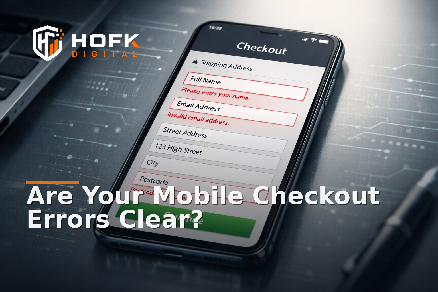
Review error states field by field, not just at form level
Most teams test whether checkout errors appear. Fewer check whether those errors are actually helpful on a mobile screen. That is the difference between an error existing and an error being usable.
What a useful field error should do
- say what is wrong in plain English
- point to the exact field
- keep the field value intact where possible
- tell the user how to fix the issue
- remain visible without forcing a scroll hunt
For example, “Invalid input” is too vague. “Please enter a UK postcode” is much better. “Card declined” may be true, but it is still weak if the user does not know whether to retry, choose another payment method or contact support.
Look for errors that only make sense on desktop
Some error messages rely on visual space that is not there on mobile. They may point to the field in a way that is obvious on a large screen but too easy to miss on a phone. If an error appears below the fold after the keyboard opens, it can be effectively hidden.
When checking errors, look at the whole sequence:
- The user taps into the field.
- The keyboard opens.
- The user submits or moves on.
- The validation message appears.
- The field remains visible and understandable.
If the error lands outside the visible area, the checkout is asking too much of the shopper.
Check the most common error-state types separately
Different errors need different treatment. A good audit splits them into categories.
Format errors
These happen when the shopper enters information in the wrong pattern, such as an incomplete postcode or email address. The message should say what format is expected and ideally give an example.
Availability or business-rule errors
These happen when the checkout cannot accept the input because of stock, delivery, or payment rules. The message should explain the restriction clearly, not just state that something failed.
Server or processing errors
These happen when the backend or a third-party service cannot complete the request. On mobile, the key question is whether the shopper can retry without losing progress.
Payment-step errors
These are the most commercially sensitive because the user is close to completing the order. If the payment step fails, the checkout should explain the next action clearly and preserve the order context where possible.
Audit field labels for consistency across the whole journey
Mobile checkout optimisation is easier when the wording stays consistent. If the basket says one thing, the checkout says another, and the confirmation page says something else, the user has to re-interpret the journey at every step.
Check for consistency in:
- delivery wording
- address naming
- guest checkout language
- payment method labels
- error wording
If your site uses the same concept in multiple places, use the same label wherever possible. That helps shoppers move through the process with less hesitation.
Test with real mobile behaviours, not ideal ones
Responsive checkout design should be tested the way people actually use it. That means checking what happens when they scroll, pause, return, and correct a mistake.
Useful tests include:
- typing a postcode and then editing it
- changing delivery options after address lookup
- submitting an empty required field
- entering a valid value, then using the back button
- switching between payment methods
- refreshing the page mid-checkout, if that is a realistic use case
What you are looking for is not just whether the checkout survives. You are checking whether the labels and errors still help the user understand what state they are in.
Create a practical mobile checkout label and error-state checklist
Use this checklist when reviewing a live checkout or a staging build:
- Is every required field labelled clearly before the user taps it?
- Does helper text add something useful, rather than repeat the label?
- Are placeholders being used as support, not as the only instruction?
- Do labels still make sense after postcode, delivery or payment changes?
- Do field-level errors say exactly what to fix?
- Are errors visible on a phone without extra searching?
- Do values remain intact after validation fails?
- Do payment errors tell the user what to do next?
- Is the wording consistent across basket, checkout and confirmation?
If you can answer yes to most of those, the checkout is probably in a better place than many mobile ecommerce flows. If not, the problem is usually one of clarity and state management rather than the checkout platform itself.
When the issue is technical rather than editorial
Sometimes the labels are fine in principle, but the responsive checkout still misbehaves because the state changes are not being handled cleanly. That can happen when address lookup, validation, delivery rules, or payment callbacks are all updating the same form in different ways.
In those cases, the fix may need implementation work rather than another copy pass. HOFK often sees this kind of problem when ecommerce teams have a checkout that looks reasonable on the surface but keeps producing unclear states on mobile. A practical review can trace where the labels, error states and layout updates are drifting apart, then decide whether the answer is front-end changes, better data handling or wider full stack development.
If the issue appears only intermittently, website monitoring can also help spot failures in checkout steps that are hard to reproduce manually.
Why this matters commercially
Small clarity problems in checkout are easy to dismiss because they do not always look like bugs. But if a field label is confusing, a validation message is too vague, or a state change leaves the shopper unsure what to do next, mobile checkout UX suffers. That can affect the checkout mobile conversion rate even when the rest of the site is strong.
The practical point is simple: users should never have to decode the checkout while they are trying to finish it. The smoother the labels and error states, the less mental effort the shopper needs to complete the order.
Conclusion
Good mobile checkout optimisation is often about fewer surprises, not more features. If the labels are clear, the error states are specific, and the checkout keeps its meaning after postcode, delivery and payment-step changes, the journey becomes easier to complete.
For responsive ecommerce sites, that clarity is worth auditing properly. Focus on field labels, helper text, validation wording and state changes on mobile first, because that is where checkout friction is easiest to miss and hardest to recover from later. If the checkout still feels unstable after the copy is corrected, the issue may be in the implementation, not the wording.
If your mobile checkout needs a cleaner technical setup, HOFK can help with ecommerce support, responsive websites, full stack development and website monitoring where implementation detail matters.
mobile checkout optimisation works best when the shopper can understand each field, recover from each error and move to the next step without guesswork.
Frequently asked questions
What is the main goal of mobile checkout field label auditing?
The goal is to check whether each label, helper text and error message is clear enough for a shopper to complete checkout on a phone without guesswork.
Why do mobile checkout error states matter so much?
Because a vague or hidden error can stop the user at the exact moment they are trying to complete an order. On mobile, small clarity issues often have a bigger effect.
What is the difference between field labels and placeholders?
Labels should stay visible and explain the field. Placeholders are only temporary examples and should not carry the whole instruction on a mobile checkout.
How do postcode and delivery changes affect checkout labels?
They can change the checkout state. If labels or helper text are not updated at the same time, the checkout can become inconsistent or confusing.
When should a developer review the checkout instead of a copywriter?
If the labels look correct but the checkout still shows stale states, hidden errors or inconsistent behaviour after updates, the issue is likely technical as well as editorial.